

Explanations & Tutorials
Top 3 Best Practices for Designing IoT Data Visualizations
These are the top 3 best design practices in data visualization to make your next IoT project informative and user friendly as possible.
These are the top 3 best design practices in data visualization to make your next IoT project informative and user friendly as possible.
Have you ever read a 15+ page research paper without any tables or diagrams? Chances are you haven’t, and even if you have, it was probably very gruesome to read. With so much information being thrown at us every second of every day, visual communication is key to preventing information burnout while also presenting important data to your users or audiences.
The practice of using charts, tables, and diagrams to present information is called data visualization. It can be used in almost any project and on any medium, provided it's used to convey real, reliable data. This article will walk you through the top 3 best design practices in data visualization to make your next IoT project as informative and user friendly as possible. Let’s get started!
Remember the Microsoft Word paperclip who would pop-up in the middle of your work to harass (...I mean help) you? A key part of data visualization is making the information more appealing and interactive. One way of making this information appealing is by adding tool-tips that give a more detailed overview of what the user is seeing. This allows the user to stay engaged with the interface while also breaking the information down into bite-sized pieces. It's a small addition that'll ultimately reduce frustration and provide more value to the user.
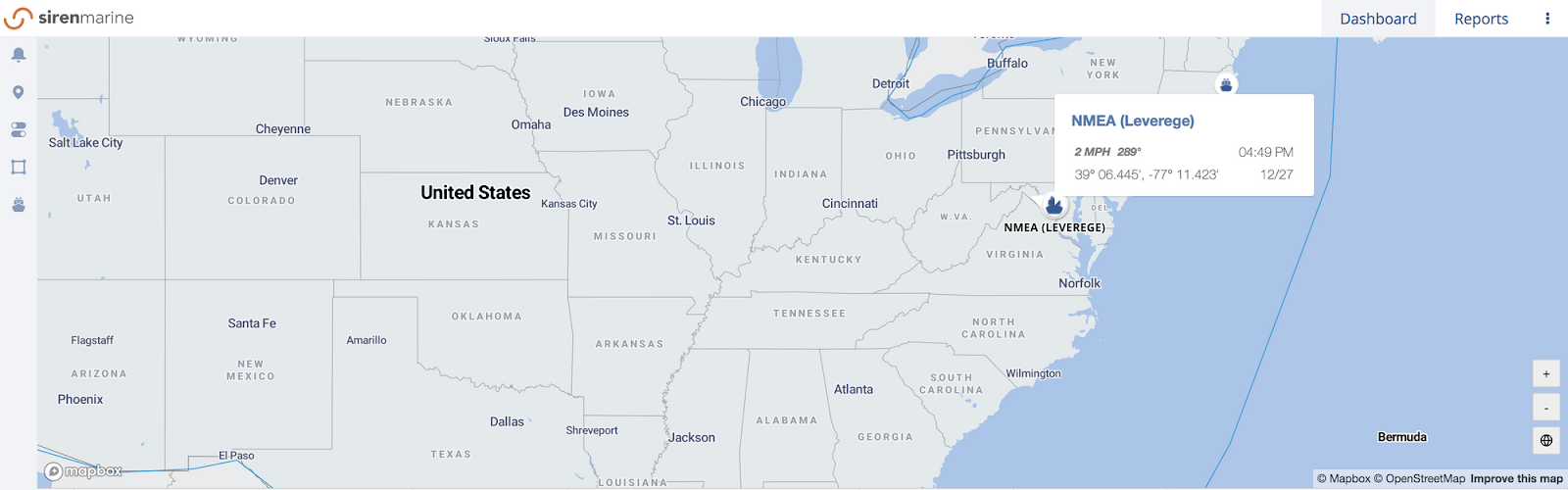
On the Siren Marine desktop fleet dashboard, users can hover over a boat to see its name, speed (if in motion), location, and a timestamp of when it was last updated.
One way to visualize data is through iconography—a collection of symbols that depict the information in a visual format. With almost every IoT project, you're going to use icons to visualize the information that's coming through the back end in order to communicate the data more efficiently with your users. This helps create a pattern in the user habits so that when a particular icon looks different, they'll get a visual cue to pay closer attention to that item. Think of it as a way of filtering and making sense of the troves of data IoT systems produce.
For example, Siren Marine's dashboard (below) has two general types of icons: a normal state and an alert state. Boats in red direct the user to click on the icon to learn more about the alert.

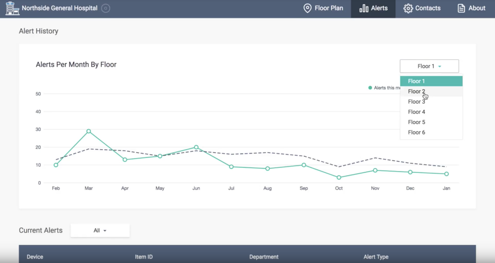
Categorization let's the user curate the data to match their immediate need. A single graph can synthesize a slew of information. Instead of having five different graphs that measure the same feature but different variables in your project, consider having one graph that can be altered to depict those different variables. This allows you to bucket all the information in a manner that lets the user compare the different variables of the same feature. Take the graph below for example, the user has the ability to choose between all of the different floors in the hospital to compare the average number of alerts per floor per month. This provides a more granular view of the sum total.
Whether you’re adding an analytics page with a slew of data, or you’re adding a small tooltip to keep your users engaged, remember that the end goal is a frictionless user experience. Your users are the ones for whom you build the product. They are the ones who will help your platform grow. Focus on improving their experience, and you’ve got yourself one heck of a product!
Join companies like Cox Communications, Yamaha, and Google who have selected Leverege to launch innovative IoT-enabled asset management applications to optimize operations, increase revenue, and delight customers.

Thanks for submitting your information. Our team will be in touch soon.

Skip the complexity of IoT and get highly configurable IoT applications tailored to your business.


.svg)

